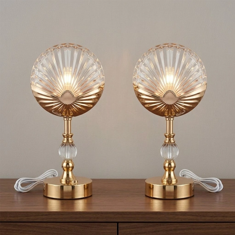

The room would begin almost dark, with a thin line of light tracing the edge of a desk lamp. Then the shade would become visible, followed by the pool of light on the work surface. For an imagined product teaser, I would make this gradual reveal the whole story. The lamp would stay still. The interest would come from how the viewer discovers its form, rather than from a dramatic camera move or a collection of unrelated effects.
The brief would be for a compact lamp intended for a home workspace. I would ask for an approved product photograph, a clear view of the shade and base, and a separate image showing the actual finish. The resulting film would be a visual concept for the product page. It would not demonstrate measured brightness, energy efficiency, or any other technical performance that requires reliable product specifications and appropriate testing.
My first decision would be the camera angle. A low three-quarter view could show the shade’s profile and the relationship between the base and desk. I would leave some empty surface beside it for the light to reach. A keyboard, plant, notebook, and coffee cup might make the room look lived in, but including all of them would dilute the reveal. One closed notebook would be enough to establish scale without becoming another subject.
In that controlled scene, Seedance 3.0 could turn the product references into a proposed moving image. The AI video model supports text-to-video, image-to-video, and reference-based video generation combining text, images, video, and audio. I would use those inputs to describe the lamp’s appearance and the pace of its reveal. The product photograph would remain the visual reference against which the generated result is judged.
Separate the object from the lighting idea
I would organise the material into two groups. Product references would define the lamp’s shape, finish, and proportions. Mood references would explain the dark room, warm light, and slow reveal. The written direction would make clear that a mood image must not replace the lamp with a different design. This is a small distinction, but it helps prevent a visually attractive draft from drifting away from the item the business actually sells.
The opening would show only a soft rim along the shade and stem. Over the next few seconds, the desk would become gently illuminated while the background stayed subdued. I would request a nearly fixed camera, with no rotation around the product. A rotating view can expose surfaces that are not clearly documented in the reference set. Starting with a stable angle gives the first draft a more manageable visual problem.
Give the reveal a readable pace
For the first Seedance 3.0 comparison, I would vary the timing of the light rather than the room. One version could reveal the shade before the desk; another could begin with the pool of light and let the fixture emerge afterward. The first tells a story about design. The second suggests the experience of sitting down to work. I would choose between them according to the intended product-page message, not simply which looks more dramatic.
A short video reference could communicate the desired pace using a different, unbranded light source in a plain room. I would label it as a timing reference only. If audio were included, it would be an approved atmospheric passage rather than a spoken performance claim. The shot should still work without sound, because visitors may encounter it in a muted feed or on a product page where audio is not enabled.
The Seedance 3.0 prompt would avoid words such as brightest, most efficient, or perfect. Those are claims, not useful visual directions. Instead, I would describe a warm pool of light expanding across a wooden surface, a matte finish remaining visible, and a background that stays quiet. The more concrete the scene becomes, the easier it is to identify what needs changing when the first draft does not match the intended mood.
See also: Four Principles Behind Communication That Builds Trust in Business
Correct the reveal without redesigning the lamp
I would inspect the Seedance 3.0 output for changes in the shade’s outline, the stem’s thickness, and the position of the base. A lamp that slowly changes shape would undermine the product story even if the light looked beautiful. If that happened, I would reduce camera movement further and simplify the lighting transition. I would also check whether the main reference photograph clearly separates the lamp from its background.
Another likely problem would be a reflection that makes a matte surface appear glossy. My revision would specify softer highlights and remove the most reflective mood reference. I would not solve the issue by accepting a more luxurious-looking finish than the actual product has. The film can be expressive about atmosphere while remaining disciplined about the object’s identity. That balance is especially important when the clip sits beside straightforward catalogue photographs.
Plan the final frame before adding graphics
The accepted Seedance 3.0 scene would end with the full lamp visible and the notebook partly illuminated. I would hold that composition long enough for viewers to understand what they are seeing. The product name and a short descriptive line would be added in the editor. Any dimensions, colour names, or technical details would come from approved product copy and remain separate from the generated imagery.
I would test the scene against both a pale and a dark page background. A very dark opening can disappear into a dark interface, while a bright surrounding page may make the subtle rim light difficult to notice. Adjusting the first frame’s visibility would be more useful than adding an attention-grabbing flash. The reveal should feel intentional in the place where it will actually be viewed, not only in a full-screen preview.
Keep the small version clear
For a vertical social edit, the Seedance 3.0 composition would need to preserve the shade, base, and visible pool of light together. If the crop removes the desk surface, the central change loses its meaning. I would check the video at phone size and shorten any pause that feels empty. The wider product-page version could retain more breathing room, because its viewer may already be interested in the object.
I would finish by saving the reference set, accepted prompt, and editable title graphic alongside the export. Seedance 3.0 would have helped explore a particular way of revealing the lamp, while the business retains responsibility for accurate product information. The final film would make one focused promise through its imagery: this is the object, this is its character, and this is the quiet workspace the creative concept imagines around it.